
Are you planning to decorate your wall with a map of national parks, where you can mark the destinations, you have traveled to? The appropriate color of your map in your interior is very important, as it determines the mood in the room and is also in accordance with the design.
Understanding the Psychology of Color in Interior Design
Colors greatly alter the perception of a room and influence our mood. In choosing world map wall decor, one must be aware of how certain tones will coexist with the interior and create the intended mood. The information regarding the psychology of color makes the map not only a decorative piece, but a true accent in the room.
Warm vs. Cool Colors — What’s the Difference?
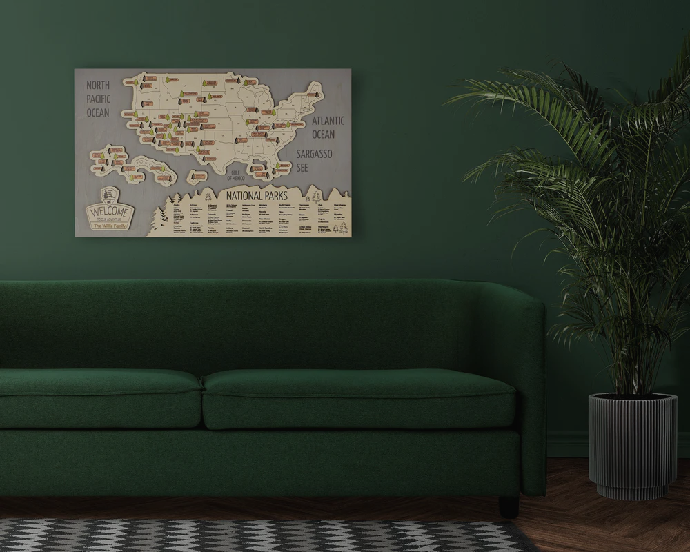
Before choosing the right map color for warm rooms or the map color for cool rooms, first understand how warm and cool colors differ from one another. Warm colors — red, orange, terracotta, beige — warm the space and make it cozy to be in, inducing a sense of closeness. Cold colors — blue, gray, green — create a sense of freshness, openness, and tranquility.
How Color Affects Mood and Space Perception
The warm color induces a feeling of having a more intimate space and visually smaller size, providing a sense of warmth. Cold colors, however, make the space large and open. When selecting interior map decor, consider how the color of the map will influence the overall impression of the room, ensuring it complements the design rather than disrupting it.

How to Match Map Colors with Your Interior Palette
It is important that the map organically combines with the color scheme of your interior. A properly selected decorative map for the home can become the central element of the room without overloading it.
|
Choosing a Map for Warm Interiors (Beige, Terracotta, Wood Tones) |
For these interiors, the map color for warm interiors is ideal: wood, gold, terracotta, or cream hues. They are mixed harmoniously with beige walls and warm wooden furniture, and the atmosphere gets warm. |
|
Choosing a Map for Cool Interiors (Gray, Blue, Minimalist Spaces) |
For minimalist or cold interiors, map color for cool interiors is optimal - gray, blue, and cool wood shades. Such maps will emphasize the modern style and add freshness and space to the room. |
|
Neutral and Earthy Tones — The Universal Choice |
If in doubt, universal neutral and earthy shades will suit any style. Such maps are easily combined with map art for modern interiors and other decorative elements, creating a harmonious look. |
Tips for Selecting the Perfect Map for Your Room
When choosing a map, consider the lighting, wall texture, and overall room style. The right wall map color combinations will highlight the style and avoid disharmony.
- Consider Lighting and Wall Color
Lighting changes the perception of color. For dark rooms, choose the best map color for living room, and for well-lit rooms, richer tones.
- Matching Frame and Material to Interior Style
The material of the map and frame must match the room's design. Wooden frames go best with rustic and traditional interiors, while minimalist or metal frames go best with Scandinavian or modern interiors.
- Balancing Texture and Visual Contrast
Combine the textures of the map and walls to avoid monotony. Contrasting details make interior map decor an accent in the room, without overloading the space.
Examples of Map Colors that Work Best in Each Interior Type
Let's consider specific map color options for popular interior styles. The right choice will help make a decorative map for home a bright and harmonious element of decor.
- Best Map Colors for Scandinavian, Boho, and Modern Styles
Light neutral and natural shades are ideal for Scandinavian, boho, and modern styles. They will emphasize the purity of lines and add lightness to the space.
- Best Map Colors for Industrial, Rustic, and Classic Interiors
Rich dark tones, terracotta, and wood would be best for industrial, rustic, and traditional interiors. These maps bring warmth and character into the space.
Common Mistakes When Choosing Map Colors
To prevent your map from looking disharmonious, you should avoid common mistakes when choosing interior map decor colors.
- Ignoring Lighting Temperature
The color of the map can look completely different in different lighting. Don't ignore the light temperature when choosing wall map color ideas.
- Choosing Colors That Clash with Wall Tones
A map should complement the wall, not blend in or clash with it. The wrong warm and cool color interiors or the wrong map color for cool interiors can ruin the overall look.
- When in Doubt — Go for Timeless Neutral Maps
When in doubt, choose neutral maps that fit any style. Neutral maps are always a safe choice and suit any interior style.

Laat een reactie achter
Deze site wordt beschermd door hCaptcha en het privacybeleid en de servicevoorwaarden van hCaptcha zijn van toepassing.